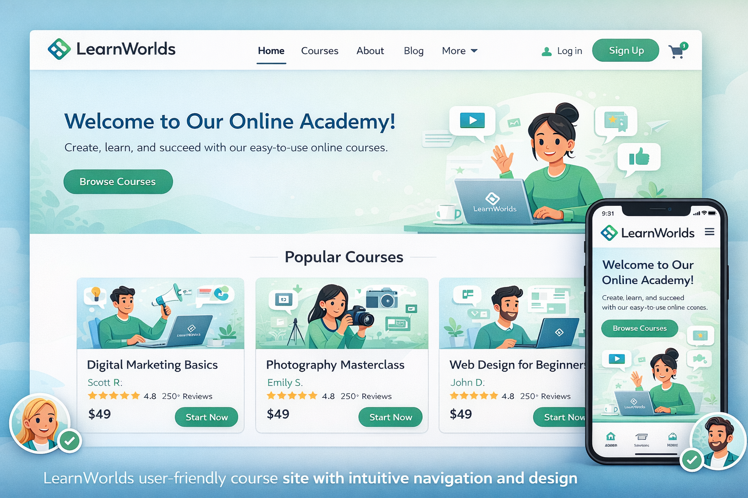
Building a course site that feels welcoming and easy to use is key to keeping students engaged and reducing drop-offs. I’ve helped many creators set up their LearnWorlds academies, and the difference between a clunky site and a smooth one often comes down to thoughtful design choices—clear navigation, consistent branding, mobile optimization, and intuitive flow.
LearnWorlds makes this straightforward as an online class platform with its no-code Site Builder, 50+ industry templates, Theme Explorer for quick styling, and built-in tools for navigation and learner experience. You don’t need design skills to create something professional and user-friendly.
This guide walks you through the practical steps to build a site that students love navigating, based on what works best in real launches.
Why User-Friendly Design Matters on LearnWorlds
A confusing site leads to frustration—students bounce before enrolling or quit mid-course. Good UX means clear paths to courses, easy sign-up, logical menus, and fast loading.
LearnWorlds excels here: responsive templates, customizable players, dynamic navigation (different views for logged-in vs. guests), and features like communities for social feel. Creators who prioritize UX see higher completion rates and better reviews.
Choosing the Right Template for a User-Friendly Start
Start with a template that matches your niche—LearnWorlds has over 50 ready-made ones for coaching, fitness, business, creative skills, and more.
- Pick industry-specific ones: Coaching templates often have strong hero sections and testimonials; fitness ones emphasize visuals and schedules.
- Preview full sites: Check homepage, course catalog, about, and login flows.
- Focus on simplicity: Avoid overloaded designs—clean layouts with prominent CTAs convert better.
Templates give you a solid, mobile-ready foundation. Customize from there without starting blank.
Customizing Your Site with Theme Explorer and Site Builder
Theme Explorer is your style hub—set consistent colors, fonts, buttons, and layouts site-wide in minutes.
- Go to Website > Theme Explorer: Choose presets or tweak individually (e.g., readable fonts like sans-serif, brand colors).
- Use Site Builder for pages: Drag-drop sections/widgets (course catalogs, testimonials, forms). Add global headers/footers for consistency.
Keep it simple: Limit fonts to 2-3, use plenty of white space, ensure high-contrast text, and add subtle animations sparingly.
Optimizing Navigation and Learner Flow
Navigation makes or breaks usability. LearnWorlds lets you control it deeply.
- Set main menus: Include Home, Courses, About, Blog, Contact—keep to 5-7 items.
- Dynamic views: Configure different after-login pages (e.g., dashboard for students).
- Course catalog: Use card widgets for easy browsing—show previews, prices, ratings.
- Course player: Choose free/sequential/prerequisite navigation based on your structure.
Test flows: Sign up as a student to ensure intuitive paths from homepage to enrollment to first lesson.
Step-by-Step: Building Your User-Friendly Course Site
- Sign up for free trial at LearnWorlds—select a template during onboarding.
- Customize basics: Settings > School Settings > upload logo/favicon, set custom domain.
- Style globally: Website > Theme Explorer > apply colors, typography, buttons.
- Edit key pages: Website > Design > Edit Website > update homepage hero, add course catalog section, testimonials, CTA buttons.
- Set navigation: Site Navigation settings—configure menus, after-login redirects, non-paying vs. paying user flows.
- Add course previews: Insert catalog widgets or custom course layout pages with benefits and enroll buttons.
- Optimize mobile: Preview on devices—adjust scaling, hide heavy elements if needed.
- Test learner journey: Create test account, enroll, navigate courses—fix pain points.
- Publish and monitor: Go live, then check analytics for drop-offs.
Most get a polished site in 1-2 days.
Real-World Example and Data Insight
A fitness coach I advised used a high-energy fitness template. She simplified the menu (Home, Programs, About, Blog), added prominent “Enroll Now” buttons, and used sequential navigation in courses for guided progress. Result: Student feedback praised the “easy to find everything” feel, and completion rates rose 35% compared to her previous basic setup.
Insight: LearnWorlds’ responsive templates and navigation options lead to better UX than rigid platforms—many creators report smoother student experiences because everything (site + player + community) feels connected.
Common Mistakes and Troubleshooting UX Issues
- Too many menu items — Overwhelms visitors. Fix: Prioritize top 5.
- Inconsistent styling — Looks unprofessional. Fix: Stick to Theme Explorer globals.
- Poor mobile experience — Most access via phones. Fix: Always preview/adjust.
- Hidden CTAs — Hard to enroll. Fix: Place buttons prominently.
- No testing — Assumptions fail. Fix: Run beta tests with 3-5 people.
- Ignoring accessibility — Small text/low contrast. Fix: Check readability tools.
Address early for best results.
FAQs
How beginner-friendly is the LearnWorlds Site Builder for user-friendly designs?
Very—drag-drop editor, presets, and templates make it intuitive; no coding needed.
What makes a LearnWorlds site user-friendly?
Clean navigation, consistent branding, mobile optimization, clear CTAs, and logical flow from homepage to course enrollment.
Can I customize navigation for different users?
Yes—set dynamic menus, after-login pages, and paying vs. non-paying views.
Which templates work best for user-friendly course sites?
Industry-specific ones with simple layouts, strong catalogs, and prominent enroll sections—preview to match your style.
How do I test the student experience on LearnWorlds?
Create a test account, enroll in a course, navigate as a learner—use Quick Start Guide 6 for checklists.
Where can I find official tips on LearnWorlds website design?
See their Quick Start Guide: LearnWorlds Quick Start Guide 3: Design Your Website.
Build a Course Site Students Love with LearnWorlds
Creating a user-friendly course site on LearnWorlds comes down to starting with a good template, applying consistent branding via Theme Explorer, simplifying navigation, and testing the full learner journey. The result is a professional academy that feels intuitive and trustworthy—helping you create course online and make online courses that retain students longer.
Start today: Pick a template in your trial and follow the steps above. Small tweaks lead to big improvements in satisfaction and sales.
Need help refining your site or UX strategy? Check more tips at https://shihabmorshed.com/. What’s one thing frustrating you about your current site setup? Share in the comments—I’ll suggest quick fixes.